Project Overview
According to the National Financial Educators Council, the average financial literacy score for youth aged 10-14 is 57% and 63% for ages 15-18. Since youth are interacting with money at younger and younger ages, how can we make learning about finances more appealing and develop more financially literate youth?
The goal was to create an e-wallet application that teaches teens financial literacy in an interactive, entertaining way. It will encourage youth to take the initiative to manage their money and make healthy financial decisions.
My Role
UX/UI Designer
May – November 2021
Responsibilites
User Research, Wireframing & Prototyping, Usability Testing, User Interface Design, Design for Accessibility
Toolbox
Adobe XD, Figma, Adobe Illustrator, Marvel App, UsabilityHub
Table of Contents
Click to navigate to each section.
THE PROBLEM
Exploratory research on e-wallets revealed that the main issue users experienced were an inability to manage their money due to a lack of financial knowledge.
Using the Double Diamond Strategy, I researched problems that users of e-wallet apps encountered. The top three problems users had were:
No financial literacy
Most users have difficulty in managing money due to a lack of financial knowledge and experience
No incentives
Most existing financial apps don't make banking fun or incentivize users to return
Too many apps
Most finance apps don't allow for all features needed (such as budgeting, money transfer, review transactions, etc.)
THE SOLUTION
Users of e-wallets need an interactive, entertaining way to improve their financial literacy because they are unable to manage their money well. We will know this to be true when we see users on PlutoPay successfully budgeting and saving their money each month.
PlutoPay gamifies the process of managing money to make it a more compelling habit. As users interact with the app, financial tips and information are provided as optional missions to be completed. Visual reinforcements and rewards are given when users make positive financial decisions, such as putting money into savings.

THE PROCESS
Following the design thinking process, various tasks were accomplished within each of the five main phases: Empathize, Define, Ideate, Prototype, and Test.
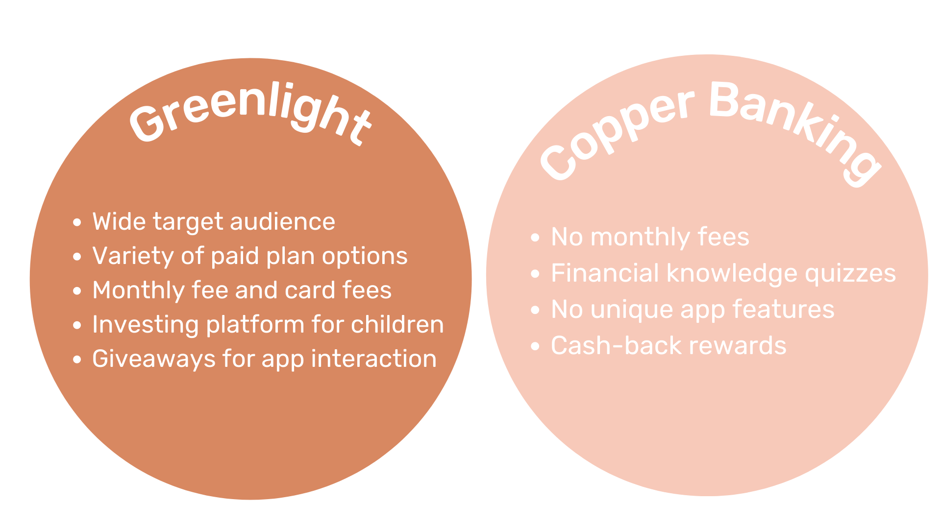
A competitive analysis of two existing teen banking apps exposed quite a few gaps within the market that have a need to be filled.
After identifying a problem and forming a hypothesis for the solution, I conducted an in-depth competitive analysis on two e-wallet applications that had a similar function.
Greenlight is a well-established, widely-used competitor within the teen banking market, while Copper Banking is a new, highly-invested-in product. They each had great, but very different features. As I mentioned was part of the problem with e-wallet apps, it was an either/or situation. What users want is an app that addresses all their financial needs and does so in a fun way.
After deciding to focus on specific issues such as building financial literacy through gamification and reward systems, the established target audience was 13 to 19-year-olds.
The intent is to target those who are beginning to use and understand the value of money. Usually, by this age, youth begin to have an income and/or interact with money in some way.
It took me some time to hone the target audience. I initially started out with a target audience of 14-21-year-olds, as I wanted both teenagers and young adults to use the app. However, once I completed some user research, I found that it would be better to target a younger, smaller audience to maximize the usefulness of the app.
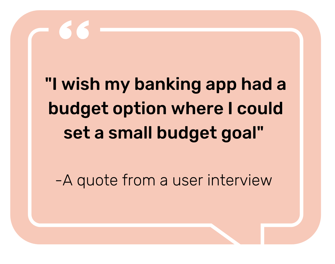
Due to such an exclusive age demographic, user interviews were conducted to better understand the target audience and their thought processes revolving around money management.
Since I was designing my product for a very specific audience, I wanted to understand the way teens thought and behaved when it came to financial applications. I conducted user interviews with 6 participants, half of which reflected my target audience. My goals were to:
- Explore users’ current method of money management, with a focus on pain points
- Learn about user experience/opinions with existing e-wallet applications
- Determine users’ desired goals regarding money management
I garnered lots of insights from the research, including both information about my target users and best practices for interviewing.
In regards to the interviews, I learned that teens are more likely to spend than save – and spend recklessly at that. Most teens also have no idea how to budget primarily because they have no need to since their parents cover bills. And while teens may not have experience managing their money, they are very familiar with money transfer apps, such as Venmo and Cash App, which they frequently use to send and receive money from friends and family.
With the data from user research, two primary user personas were created to address the different types of users.

Meet Liam
Liam is a 17-year-old high school senior who has a part-time job but spends all his money on entertainment and food. He needs to start saving for college but doesn’t know how to budget his money.

Meet Ava
Ava is a freshman in high school who grew up with a phone in her hand. She is constantly wanting to buy the next trendy Internet item which she can’t afford without an allowance from her mother.
User flows were constructed to map out the steps users would take through the app to complete their main tasks, which included creating a budget goal and transferring money.
These user flows were developed with user stories, user journey maps, and mental models in mind. Objectives were defined for each user persona, which were then translated into specific tasks that the user could accomplish through PlutoPay.
Low-fidelity wireframes were hand-sketched, then translated into mid-fidelity wireframes in Adobe XD.
At first, I only sketched out screens for the main features of PlutoPay. As I fleshed out other screens in design software, the designs changed several times. Basic lo-fi designs were edited and added to, icons were changed, and more screens were added as they were transformed into mid-fidelity wireframes.
After this project, I’d definitely consider myself an advanced Adobe XD user!
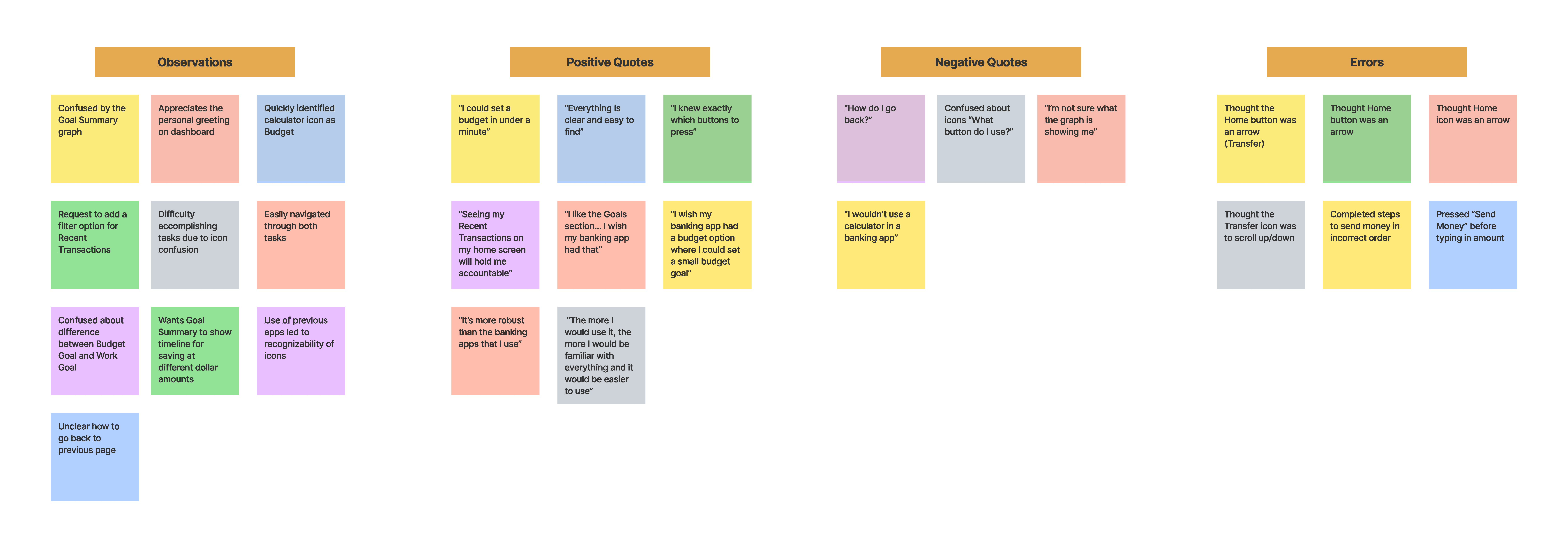
Through usability testing, I evaluated the ability with which users could navigate the application and complete main tasks, as well as determined the most prominent errors users encountered.
Six participants completed moderated, in-person usability tests with the mid-fidelity prototype. Five out of six participants were able to complete all of the given tasks, and 85% of participants rated the tasks as “Very Easy” to accomplish, according to J.R. Lewis’ After-Scenario Questionnaire satisfaction metric.
However, users still experienced errors during testing, which were categorized based on their severity using Jakob Nielsen’s Severity Ratings scale.
Revisions were made accordingly based on the analysis of the test results.
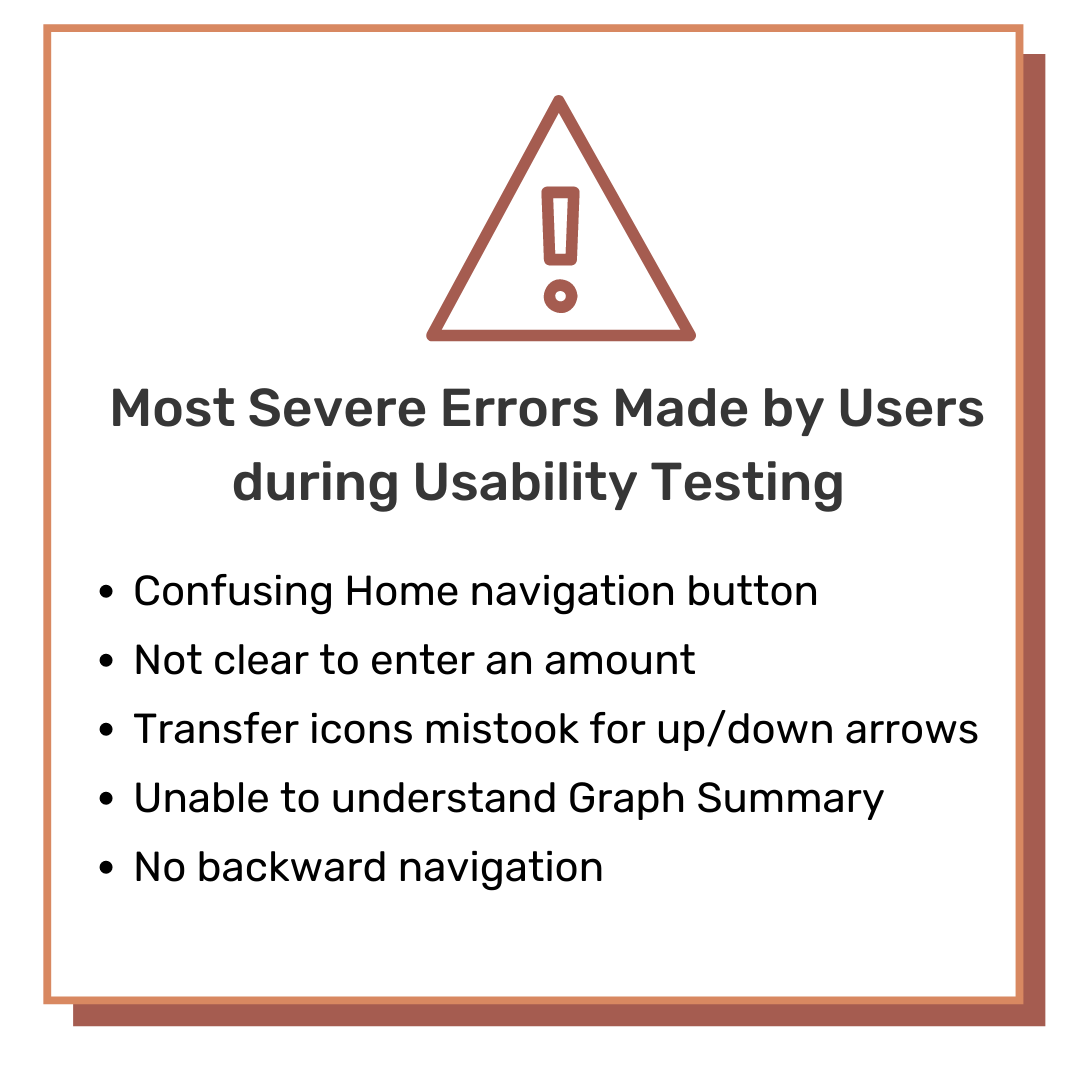
Affinity map of usability testing results.
In order for PlutoPay to be interactive and entertaining while also being educational and useful, I designed a playful user interface that adopted a space theme to teach users about money management.
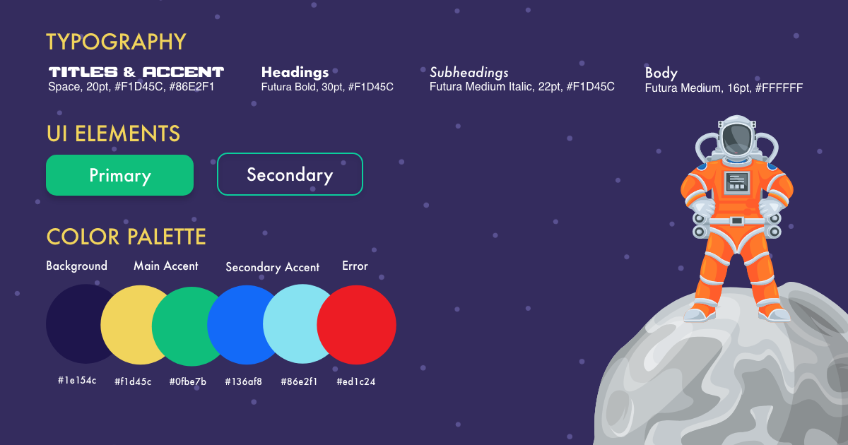
When you think of a banking app, the word “fun” isn’t usually associated with it. As an app that is targeted towards teens aged 13-19, I wanted to create a product that was entertaining and visually intriguing while also being educational and useful. The design for PlutoPay revolves around the theme of space, which provides an expanse of interesting elements to play around with and fun ways to illustrate concepts, including delightful animations and rewarding interactions.
Using the Gestalt Laws of Grouping and Principles of Design, I updated several of my wireframes to improve the design, as well as edited them to be accessible. Some changes included editing colors to be higher contrast, adding symbols to alert users about errors (rather than relying on color), and adding effects to designate links.
To keep the UI design of my app consistent, I created a style guide with elements such as typography, color palette, UI elements, language guidelines, and more. This is an important document that I and other designers could use to reference when updating the app. I also developed the Design Language System for the app, an important document to make the handoff to other designers and developers easier.
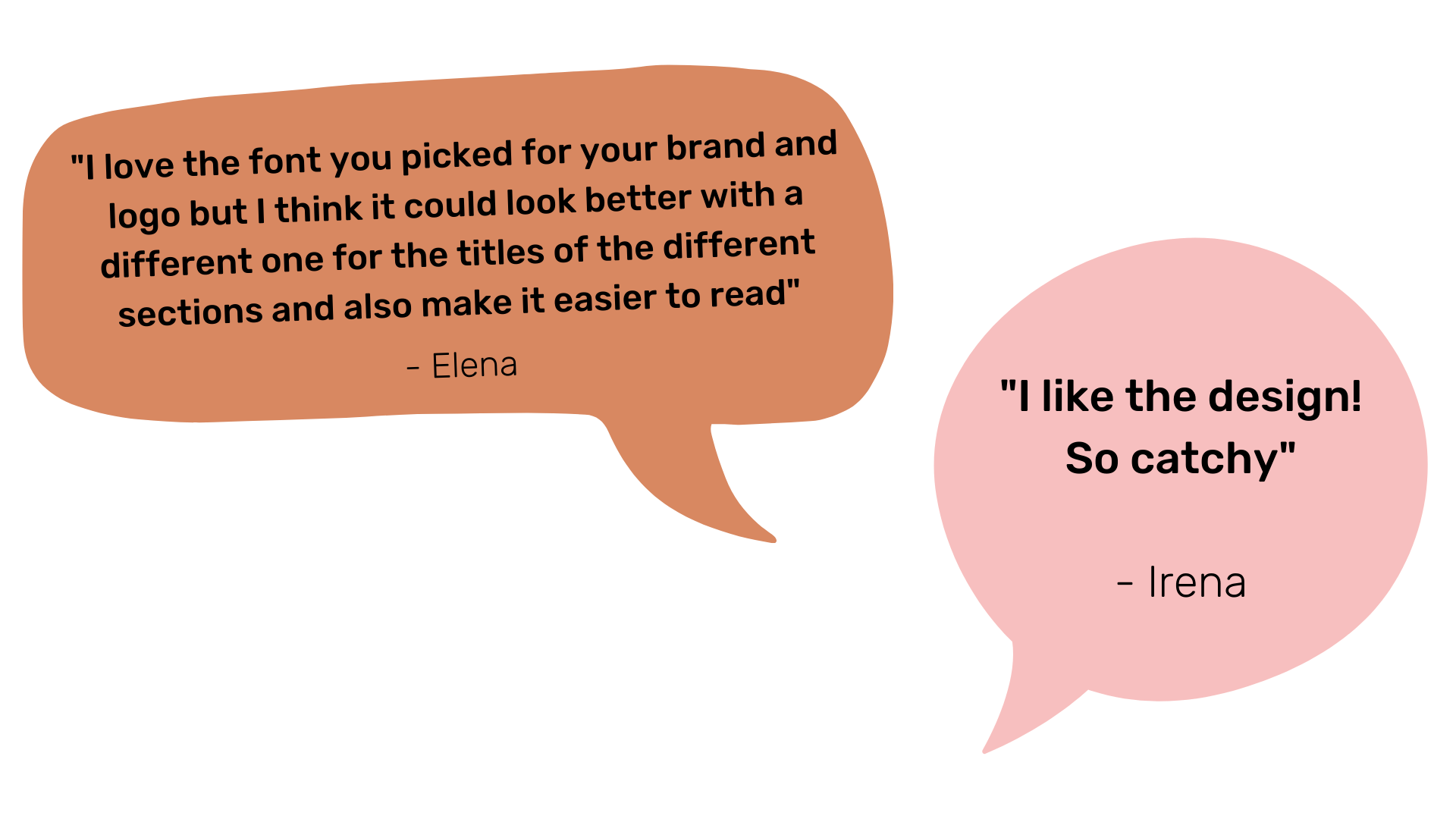
Fellow UX designers offered feedback about the design of my app, which I iterated upon to create the final wireframes.
While all of the peer feedback was constructive, and most of it was valuable, I had to decide which pieces of advice would benefit my app. I chose to iterate upon features that related mostly to navigational ability and design specifics such as typography.
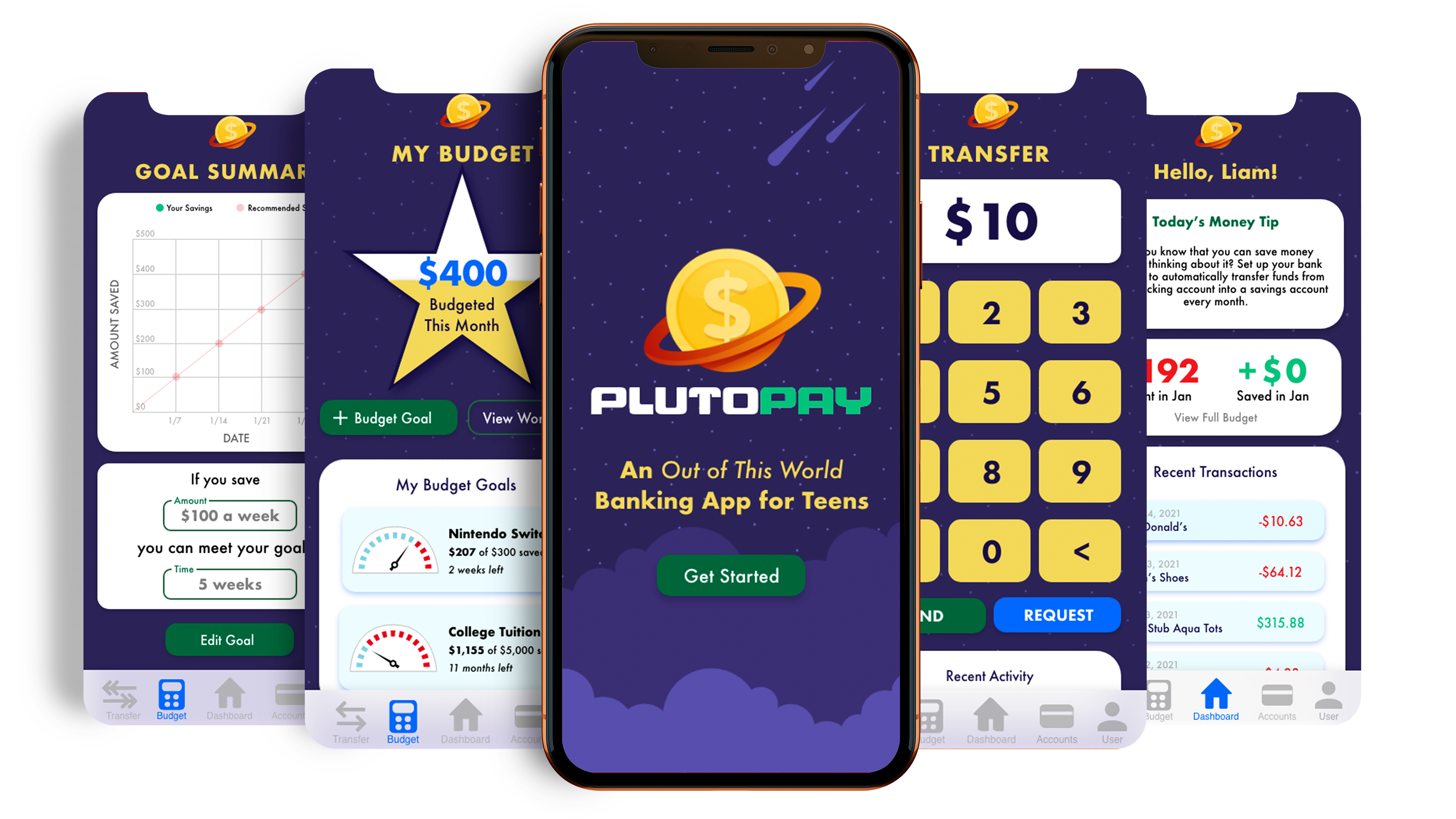
After several iterations, the final prototype of PlutoPay includes features such as budget goals and tracker, daily money tips, money transfer, savings calculator and more!
Learn how to use PlutoPay to accomplish financial tasks with this video tutorial!
Retrospective
This was a very exciting project to work on as a part of my User Experience Design certification course at CareerFoundry! I learned a lot about myself as a designer, including what my greatest strengths and weaknesses are, both creatively and technically.
Some of the biggest lessons I encountered were:
Comparison is the thief of joy
While working on this project, it was at times difficult not to compare my app to existing ones, especially because there were so few. I had to remember that my intent was not to recreate other app features but to create an entirely new, engaging experience for users. Keeping my users in mind while designing PlutoPay helped hone my focus.
Are the users are always right?
When completing user research there is much to be learned. While there were overarching or obvious issues that I encountered during user interviews, not all user complaints were necessary or worth being solved. I identified the main pain points users had with e-wallets and addressed those through PlutoPay.
The work is never done
As much as I would love it, perfection is never reached and products need to constantly evolve. Iterations were such a big part of making this a successful project, and even as I work on this case study, they are still being made!
Next Steps
The next step for my project will be to develop the app for another user – parents and guardians of teens. Not only is an adult account is required for users under the age of 16, but adults are also encouraged to guide their children through their financial literacy journey. Special features on this type of account will include creating work/chore goals, setting spending limits, and more.

