Responsive Portfolio
Front-End Development
Context and Purpose
One of the most vital products as a User Experience Designer is the portfolio. A place to exhibit your best projects and demonstrate your value as a designer, a portfolio is viewed not only by other designers and professionals, but by potential employers. These employers seek unique, neat, usable, and informative portfolios that display technical ability.
By coding my own portfolio using HTML, CSS, and JavaScript, I was able to create a responsive portfolio that fulfilled all of these requirements and was customized exactly how I wanted it to be, right down to the spacing.
My Role
Front-End Developer, UX Designer
November – December 2021
Responsibilities
Writing HTML/CSS/JavaScript, User Testing, Cross-Browser Testing, Checking Code Quality
Toolbox
Atom, GitHub, HTML5/CSS3, JavaScript, jQuery
Table of Contents
Click to navigate to each section.
THE CHALLENGE
As a UX Designer, it is helpful to have an understanding of the development process in order to design with it in mind and to make handoff to developers easier. It’s also essential to have a place to showcase your work to your network and potential employers. So, my challenge was designing and coding a responsive online portfolio using HTML, CSS, and JavaScript.
GOALS
- Write clean, error-free, functional code
- Create a website that is responsive across all devices (mobile, tablet, desktop)
- Create a website that works properly across all modern browsers and operating systems
THE TARGET USER
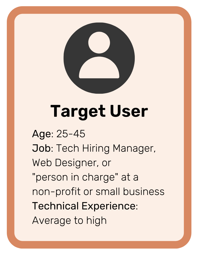
When designing my website, I developed a profile for the target user of my portfolio. I defined characteristics such as the average age, job, and technical experience.
In my case, the target user for my portfolio is a) hiring manager at a company, b) other UX designers, or c) supervisors at non-profits or small businesses with an average or high level of technical experience. Therefore, my website needs to be accessible and apprehensible to all of these types of users.
Phase 1: Creating the Foundation
Before writing a single line of code, the first task was to compile all the text copy, PDF files, and images for my website. It was important to have all this beforehand so that I could simply insert the text or paths into my code as I wrote it.
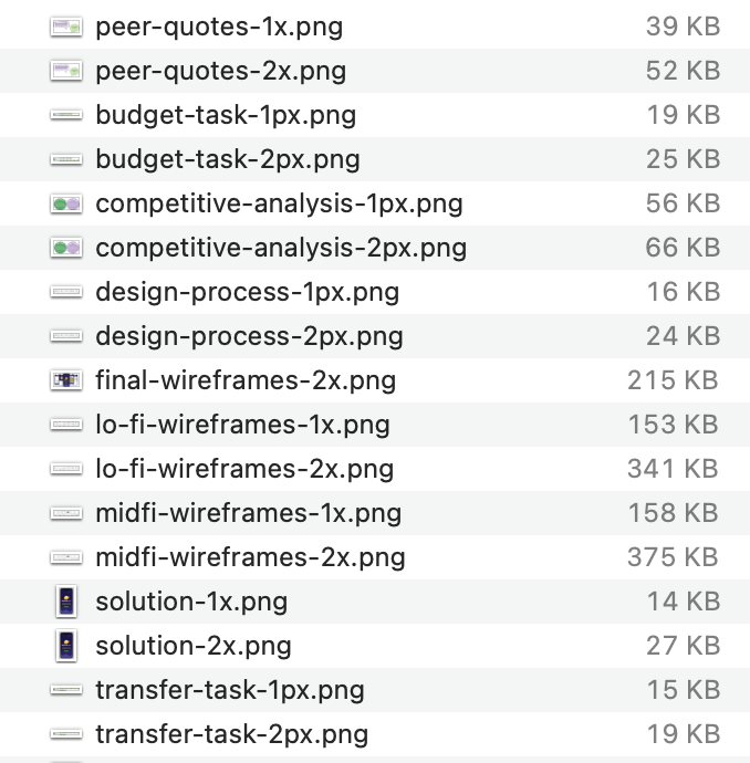
For each of my images, I created two versions – one for larger screens at a 1200px width, and one for smaller screens at a width of 600px. I then compressed all the images so that they would have a smaller file size, thus decreasing loading time for my site.
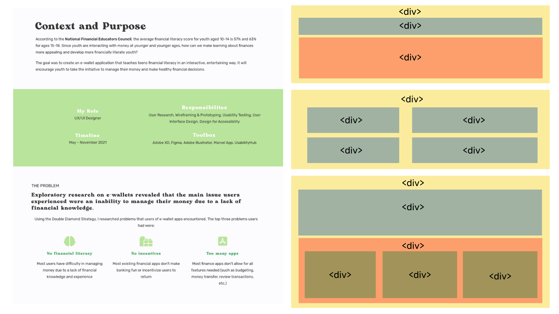
After compiling all of my website copy, I began to layout the basic page HTML, including a header, footer, main, and body elements.
Since I was working off a pre-designed portfolio site, I was able to take existing pages and visually divide them up into elements to use as a map, which helped simplify my coding process.
Phase 2: Adding Style
To style the look and feel of my website, I created an external style sheet where I could define and edit the color, typography, and layout of each page.

Heading 1
Rubik, 1.875em, 700 weight
Heading 2
Rubik, 1.65em, 700 weight
Heading 3
Rubik, 1.45em, 700 weight
Heading 4
Rubik, 1.35em, 400 weight
Heading 5
Rubik, 1em, 700 weight
Body Text
Rubik, 16px, 400 weight

To create one of the most basic UI elements for my page, the button, I had to style for various states – hover, active, and visited. These states are very important because they create feedback for the user, which is how they know to interact with it.
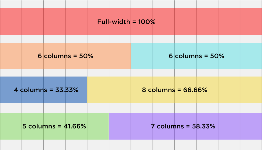
Using a CSS grid layout, I developed columns within several elements. Based on the type of content I wanted to place in each column, I adjusted the width of the column accordingly. For example, when I placed an image in a column next to a block of text, I usually wanted the image to take up more space. In these cases, I would stretch the image across more columns, while leaving the text column smaller.
In order to create responsive webpages, I utilized media queries in the CSS. Because I used a mobile-first layout, I only needed to add queries for larger screens. I used the following breakpoints:
Small screens up to 640px
Medium screens up to 1024px
Large screen sizes up to 1440px
Extra large screens of 1441px and up
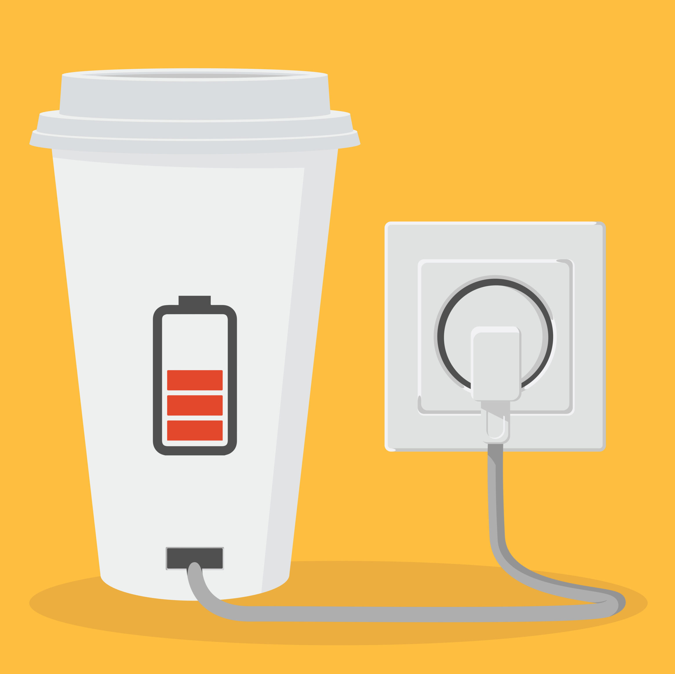
Before (static)
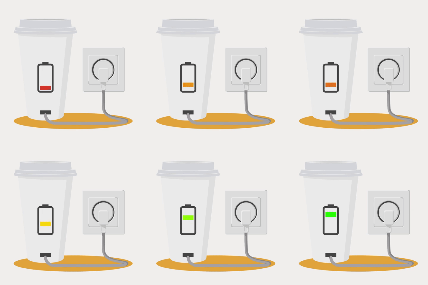
After (animated)
To add some simple movement within my home page, I animated a scalable vector graphic (SVG) file using CSS transitions and animations.
First, I found a vector I like online, then used a text editor to copy the HTML code onto my index page. The code for the animation was not labeled well, so it took some tinkering to identify certain elements within the image. I decided to edit the battery level element of the vector. I wanted to animate it so that it looked like the battery was charging.
Using CSS keyframes, I changed the color of the battery from a static red to three different colors at various frames of the animation – starting with red, then yellow, then green. Using transition and animation properties, I added a vertical scale so that the battery level would move up, appearing as if it were charging.
Phase 3: Adding Interactivity
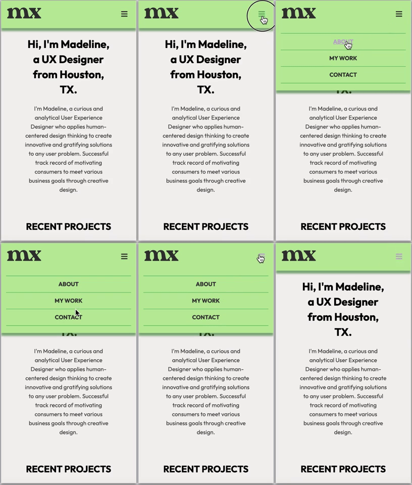
Using the programming language JavaScript, I added interactivity to the website.
Admittedly, JavaScript was not as easy for me to grasp as HTML/CSS. While I knew what kind of interactions I wanted my website to have, coding them was not so easy.
I primarily used JS to create a mobile hamburger menu for mobile screens (640px and smaller) that users could toggle.
Testing with Users and Browsers
User testing revealed issues with the main navigation and projects on my portfolio.
Now that my website was finalized, it was time to test on users. I defined user goals and turned those into scenarios with tasks for users to accomplish on my portfolio. I completed moderated in-person testing with 5 participants.
The user goals for my portfolio were:
- Navigate to the most recent project.
- Download a PDF of my resume.
- Locate my contact information.
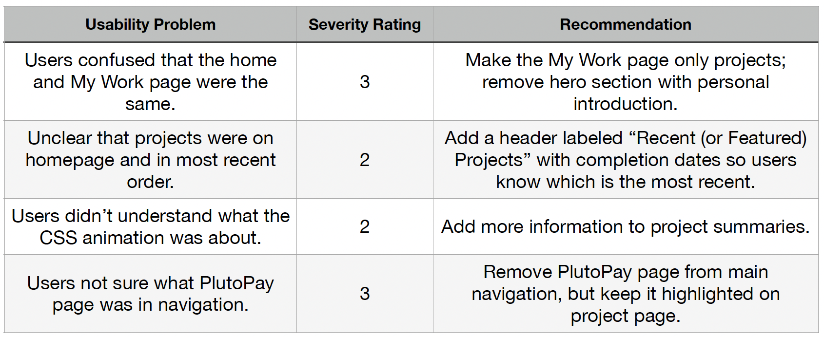
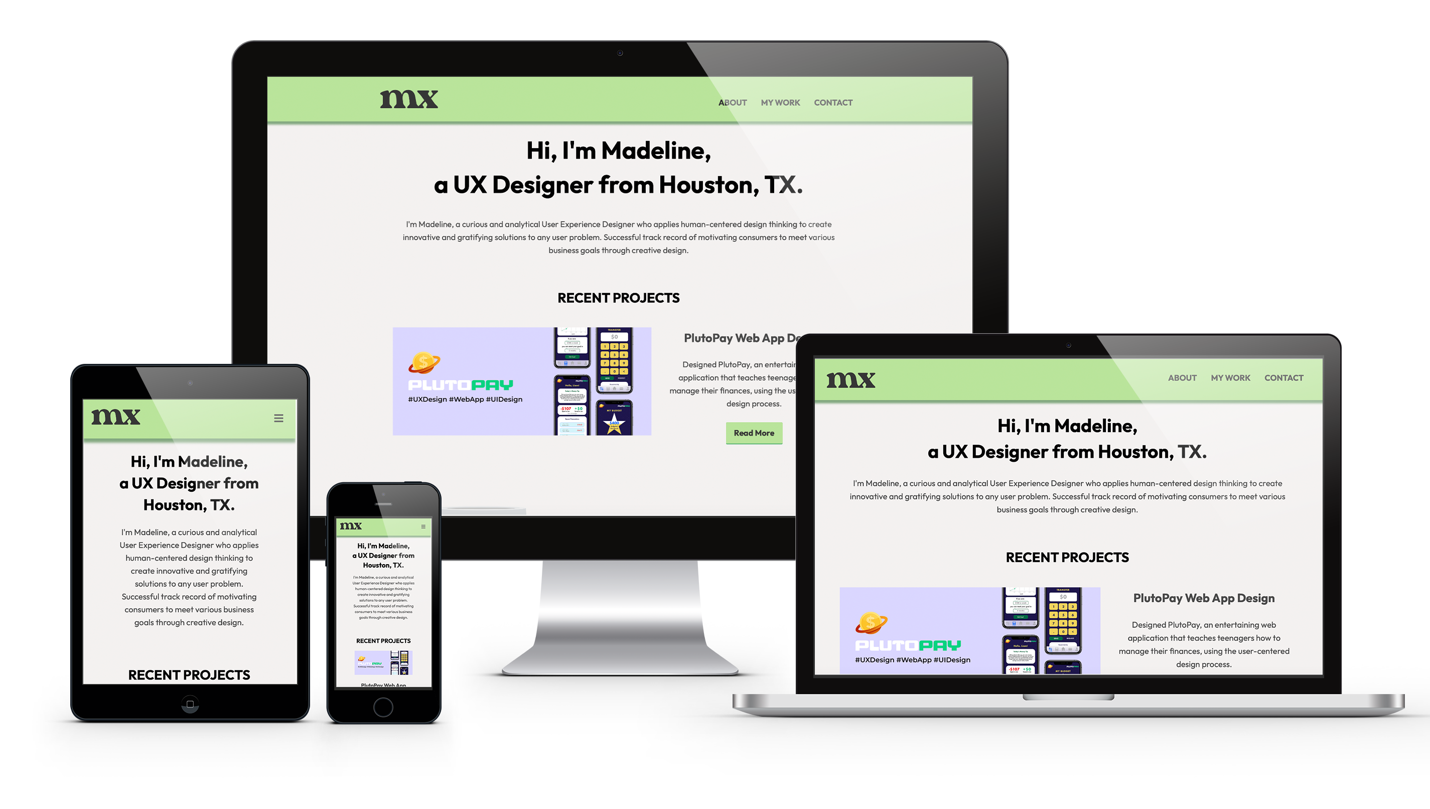
After iterating upon my design using the feedback from usability testing, I moved into checking my code quality and testing the website across various browsers.
Throughout the project, I consistently validated my code using freeformatter.com, as well as formatted my code with webformatter.com, to make sure that there were no errors as I built upon the code in each phase. This was beneficial to me during testing since it meant my code was already error-free and correctly formatted!
To verify that the website was fully functional and responsive across all platforms, I tested it on modern browsers (Safari, Chrome, Edge, and Firefox) and popular operating systems (iOS and Android OS).
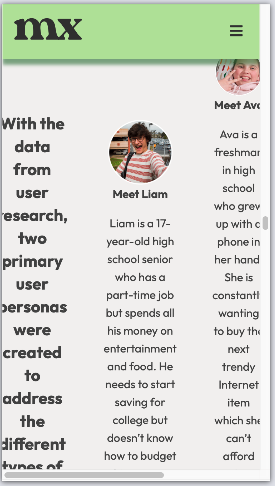
Before
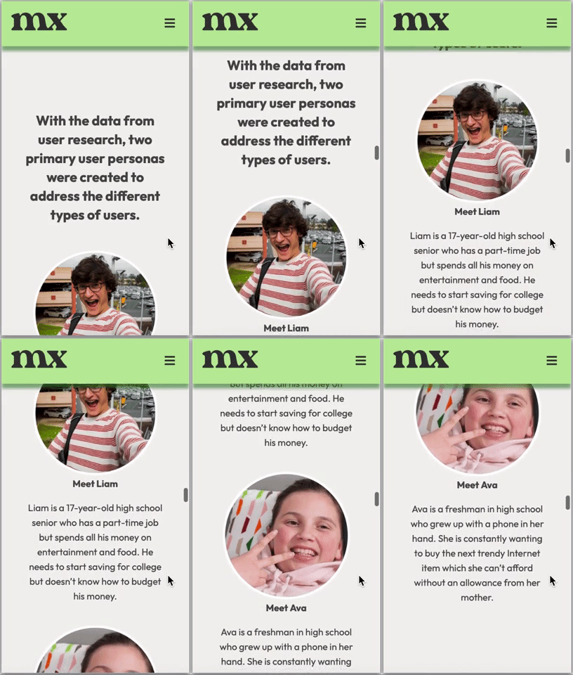
After
During mobile testing, I noticed that it was difficult to read several text and images because, rather than have stacked single columns, all three columns were shown on one row. I later found this to be a result of using both flexbox and column techniques as I attempted to vertically align my columns. I was able to solve it by employing a few more additional values, such as flex-direction and adding a full width for the columns on smaller screens.
After fixing this issue, there were no errors on any of the browsers or operating systems!
The Solution
I’m very proud of the result of my coding efforts! While it’s still a very basic website, it has valuable features, such as a minimal navigation, embedded animations, and it’s responsive!
I look forward to adding more pages and features as I continue my UX journey. I will also continue on my programming and development journey, as a new goal of mine is to code an app for one of my upcoming projects!
